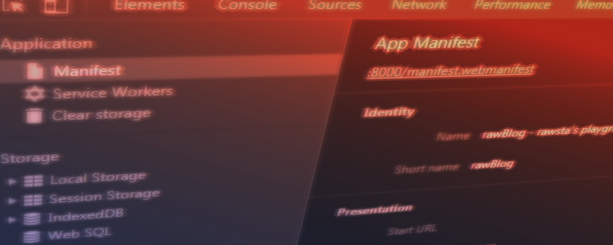
WebManifest
Das Webmanifest ist ein wichtiger Bestandteil der Progressive Web App, da dort Angaben zu StartURL, Ausrichtung, Sprache, Farben, Icons, etc. festgelegt werden.
Wichtige Informationen dabei sind die Icons. Ohne passende Icons, kann eine PWA nicht installiert werden.
Je nach Betriebssytem, sind unterschiedliche Icons relevant.
Einbindung mit <link rel="manifest" href="manifest.json">
statt
.jsonkann man auch.webmanifestals Dateiendung angeben. Support ist jedoch schlechter/ungewiss
Allgemeines
"name" , "short_name"sind der Name und alternative Kurzform"description"ist eine kurze Beschreibung der App"theme_color","background_color"beziehen sich auf die OS- und SplashScreenfarben"icons"array mit den verschiedenen Icons,etc. ( Sicherheitshalber klassischer Fallback (<meta ...>) im Head )"serviceworker"kann zur Sicherheit nochmal angegeben werden. Bspw. falls mehrere SW in anderen Scopes laufen."dir"ltr oder rtl - Schreibrichtung"lang"Sprache bspw. de-DE oder fr."share_target"sharing
selten benötigt
"screenshots"Array mit Screenshots (Previews)"categories"für die auflistung in Katalogen,etc. Standartisierte Kategorien"related_apps"falls es richtige/native Apps gibt"prefer_related_application"boolean ob die native App soll vorgezogen werden"iarc_rating_id"Quasi wie FSK
Besondere Elemente
Start URL / Scope
{
  "start_url": "/pwa/demo.html", //es können auch Parameter für tracking mitgegeben werden
  "scope": "/pwa/" // rahmen in dem sich bewegt werden kann. andere urls werden geblockt (auch "/")
};
Display Mode
{
  "display": "standalone" //fullscreen, minimal-ui, browser
};
fullscreen
verbirgt steuerelemente des browsers und des OS. ...halt FULLscreen
standaloneist eher normales Appverhalten. Nur bei "standalone" wird "add to homescreen" angezeigt!minimal-uibrowser mit reduzierter uibrowsernormale Browserdarstellung. (partielle Unterstützung)
Kann auch mit CSS angesprochen werden:
@media all and (display-mode:standalone)
Screen Orientation
{
  "orientation": "portrait"
};
- `any`
- beliebige Ausrichtung
- `natural`
- natürliche Ausrichtung des Devices (mobil meist portrait)
- `landscape`,
- quer/breitbild (primary&secondary)
- `portrait`
- normal/hochkant(primary&secondary)
- `landscape-primary`, `portrait-primary`
- Primäre _Standart_ Ausrichtung
- `landscape-secondary`, `portrait-secondary`
- Sekundäre _Auf-dem-Kopf_ Ausrichtung
kann auch über die Screen-Orientation API mit JS angesprochen werden.
screen.orientation.lock('portrait')
screen.orientation.lock('landscape')
screen.orientation.unlock()
und auch mit CSS ansprechbar:
@media all and (orientation:portrait) {
  /* ... */
}
SplashScreens
Damit sich der Start eine PWA auch wie eine "richtige" App anfühlt, empfiehlt es sich einen SplashScreen hinzuzufügen.
Wenn im Manifest name, background_color, icons(min.512x512px und als .png) gesetzt sind, zeigt Chrome/Android automatisch einen an.
Android füllt den Bildschirm mit der Hintergrundfarbe und zeigt mittig das Logo an.
Nur Safari benötigt eine Extrawurst.
Für eine optimale Abdeckung (iPhone,iPad,iMac) ist bisher der einfachste Weg über eine Kombination von Media Queries und <link rel="apple-touch-startup-image" />
<link rel="apple-touch-startup-image" href="images/splash/launch-640x1136.png" media="(device-width: 320px) and (device-height: 568px) and (-webkit-device-pixel-ratio: 2) and (orientation: portrait)">
<link rel="apple-touch-startup-image" href="images/splash/launch-750x1294.png" media="(device-width: 375px) and (device-height: 667px) and (-webkit-device-pixel-ratio: 2) and (orientation: portrait)">
<link rel="apple-touch-startup-image" href="images/splash/launch-1242x2148.png" media="(device-width: 414px) and (device-height: 736px) and (-webkit-device-pixel-ratio: 3) and (orientation: portrait)">
<link rel="apple-touch-startup-image" href="images/splash/launch-1125x2436.png" media="(device-width: 375px) and (device-height: 812px) and (-webkit-device-pixel-ratio: 3) and (orientation: portrait)">
<link rel="apple-touch-startup-image" href="images/splash/launch-1536x2048.png" media="(min-device-width: 768px) and (max-device-width: 1024px) and (-webkit-min-device-pixel-ratio: 2) and (orientation: portrait)">
<link rel="apple-touch-startup-image" href="images/splash/launch-1668x2224.png" media="(min-device-width: 834px) and (max-device-width: 834px) and (-webkit-min-device-pixel-ratio: 2) and (orientation: portrait)">
<link rel="apple-touch-startup-image" href="images/splash/launch-2048x2732.png" media="(min-device-width: 1024px) and (max-device-width: 1024px) and (-webkit-min-device-pixel-ratio: 2) and (orientation: portrait)">
Sharing
Falls Sharing auf der Seite eingesetzt wird, können hier ziel, usw. eingestellt werden.
"share_target": {
      "action": "index.html",
      "params": {
        "title": "title",
        "text": "text",
        "url": "url"
      }
};
Zusätzlich (und als Fallback) ist es zu empfehlen die Angaben als Metaangaben im Head zu ergänzen.
Meta Angaben
Diese Liste zeige alle Optionen. Diese Angaben sind nicht notwendig, sondern eher ergänzend als Fallback.
<!-- Android  -->
<meta name="theme-color" content="red">
<meta name="mobile-web-app-capable" content="yes">

<!-- iOS -->
<meta name="apple-mobile-web-app-title" content="Application Title">
<meta name="apple-mobile-web-app-capable" content="yes">
<meta name="apple-mobile-web-app-status-bar-style" content="default">

<!-- Windows  -->
<meta name="msapplication-navbutton-color" content="red">
<meta name="msapplication-TileColor" content="red">
<meta name="msapplication-TileImage" content="ms-icon-144x144.png">
<meta name="msapplication-config" content="browserconfig.xml">

<!-- Pinned Sites  -->
<meta name="application-name" content="Application Name">
<meta name="msapplication-tooltip" content="Tooltip Text">
<meta name="msapplication-starturl" content="/">

<!-- Tap highlighting  -->
<meta name="msapplication-tap-highlight" content="no">

<!-- Disable night mode for this page  -->
<meta name="nightmode" content="enable/disable">

<!-- Fitscreen  -->
<meta name="viewport" content="uc-fitscreen=yes"/>

<!-- Layout mode -->
<meta name="layoutmode" content="fitscreen/standard">

<!-- imagemode - show image even in text only mode  -->
<meta name="imagemode" content="force">

<!-- Orientation  -->
<meta name="screen-orientation" content="portrait">
Meta - Icons
<!-- Main Link Tags  -->
<link href="favicon-16.png" rel="icon" type="image/png" sizes="16x16">
<link href="favicon-32.png" rel="icon" type="image/png" sizes="32x32">
<link href="favicon-48.png" rel="icon" type="image/png" sizes="48x48">

<!-- iOS  -->
<link href="touch-icon-iphone.png" rel="apple-touch-icon">
<link href="touch-icon-ipad.png" rel="apple-touch-icon" sizes="76x76">
<link href="touch-icon-iphone-retina.png" rel="apple-touch-icon" sizes="120x120">
<link href="touch-icon-ipad-retina.png" rel="apple-touch-icon" sizes="152x152">

<!-- Startup Image //siehe Abschnitt über SplashScreen für weitere Informationen -->
<link href="touch-icon-start-up-320x480.png" rel="apple-touch-startup-image">

<!-- Pinned Tab  -->
<link href="path/to/icon.svg" rel="mask-icon" size="any" color="red">

<!-- Android  -->
<link href="icon-192x192.png" rel="icon" sizes="192x192">
<link href="icon-128x128.png" rel="icon" sizes="128x128">
Beispiele
Beispiel 1 - Absolutes Minimum (noch keine PWA)
{
  "name": "Mini Manifest",
  "start_url": "/",
  "icons": [{
    "src": "images/icon.png",
    "sizes": "192x192"
  }]
}
Beispiel 2 - Regulärer Umfang
{
  "short_name": "Maps",
  "name": "Google Maps",
  "icons": [
    {
      "src": "/images/icons-192.png",
      "type": "image/png",
      "sizes": "192x192"
    },
    {
      "src": "/images/icons-512.png",
      "type": "image/png",
      "sizes": "512x512"
    }
  ],
  "start_url": "/maps/?source=pwa",
  "background_color": "#3367D6",
  "display": "standalone",
  "scope": "/maps/",
  "theme_color": "#3367D6"
}
Beispiel 3 - Mehr App als PWA
{
  "name": "Super Racer 3000",
  "description": "The ultimate futuristic racing game from the future!",
  "short_name": "Racer3K",
  "lang": "en",
  "dir": "ltr",
  "icons": [{
      "src": "./img/lowres.webp",
      "sizes": "64x64",
      "type": "image/webp"
    },
    {
      "src": "./img/hd_hi.ico",
      "sizes": "72x72 96x96 128x128 256x256"
    },
    {
      "src": "./img/hd_hi.svg",
      "sizes": "72x72"
    },
    {
      "src": "./img/icon-128x128.png",
      "sizes": "128x128"
    },
    {
      "src": "./img/icon-144x144.png",
      "sizes": "144x144"
    },
    {
      "src": "./img/icon-152x152.png",
      "sizes": "152x152"
    },
    {
      "src": "./img/icon-192x192.png",
      "sizes": "192x192"
    },
    {
      "src": "./img/icon-384x384.png",
      "sizes": "384x384"
    },
    {
      "src": "./img/icon-512x512.png",
      "sizes": "512x512"
    }],
  "scope": "/racer/",
  "start_url": "/racer/start.html",
  "display": "fullscreen",
  "orientation": "landscape",
  "theme_color": "#ff0000",
  "background_color": "red",
  "serviceworker": {
    "src": "sw.js",
    "scope": "/racer/",
    "update_via_cache": "none"
  },
  "screenshots": [{
    "src": "screenshots/in-game-1x.jpg",
    "sizes": "640x480",
    "type": "image/jpeg"
  },{
    "src": "screenshots/in-game-2x.jpg",
    "sizes": "1280x920",
    "type": "image/jpeg"
  }],
  "related_applications": [
  {
    "platform": "play",
    "url": "https://play.google.com/store/apps/details?id=com.example.app1",
    "id": "com.example.app1"
  }, {
    "platform": "itunes",
    "url": "https://itunes.apple.com/app/example-app1/id123456789"
  }]
}
Relevante Tools & Links
Tools:
Weitere Informationen
Sonderfälle bei Browsern
Android Benötigt nicht viele Icons. Ein Icon in 192px skaliert gut auf den meisten Geräten.
iOS Mobiler Safari setzt bei "Add to Homescreen" einen schwarzen Hintergrund bei PNG Icons. Für Hintergrund JPG nutzen. PWA/manifest.json Support erst ab iOS12. Besonderheiten ab iOS12.2
UC Browser Meta tag browsermode funktioniert nicht. Link tag icon für homescreen funktioniert nicht.